Job Hunting Is Such a Pain. So I Let an AI Do the Boring Bit.

Job hunting is such a pain.
There, I said it. So many different websites, so many different layouts, and every single one wants you to fill in the same details all over again. Name, email, work history, upload the CV, now type the CV back in by hand because the parser mangled it. Again. And again. (You know the drill.)
I just got curious about exploring some new opportunities, because I’ve learned never to put all my eggs in one basket. But the moment I started, I remembered exactly why it’s such a slog. The admin is soul-destroying.
So I did what I always do these days. I went looking for a tool.
Chat first, forms never
Turns out there are a few AI job-hunting tools out there now. The one I landed on is called Jack & Jill, and the thing that sold me is that it works like a chat. If you’ve used Claude or ChatGPT, you already know how to use it. You just… talk to it.
You tell it what you’re after. It goes and finds roles that fit. And here’s the bit I actually liked: when it shows you something you don’t want, you don’t go hunting for a filter or untick fifteen boxes. You just tell it why. “No, not that one, too much travel.” And it remembers. It saves that to its memory, so the next batch of suggestions stops showing you the stuff you already said no to.
That’s the whole game, really. It learns your no as much as your yes.
I’m not going to pretend it was instant. It took me about an hour to set up and start applying for roles that actually fit what I was looking for. The setup itself was easy enough, but I still had to go back and forth a bit, correcting it, telling it why a suggestion missed the mark. Fair enough. That’s an hour once, not an hour per site, every single time.
The bit the geek in me noticed
Here’s where I put my other hat on.
The layout is dead simple. Left side is your menu. The middle is the chat, front and centre, where all the actual work happens. And the right side is the part that changes depending on what you click in the menu. That’s it. Three panels, and you always know where you are.
Here’s that same three-panel shape across a few of the screens. Click any to zoom in.
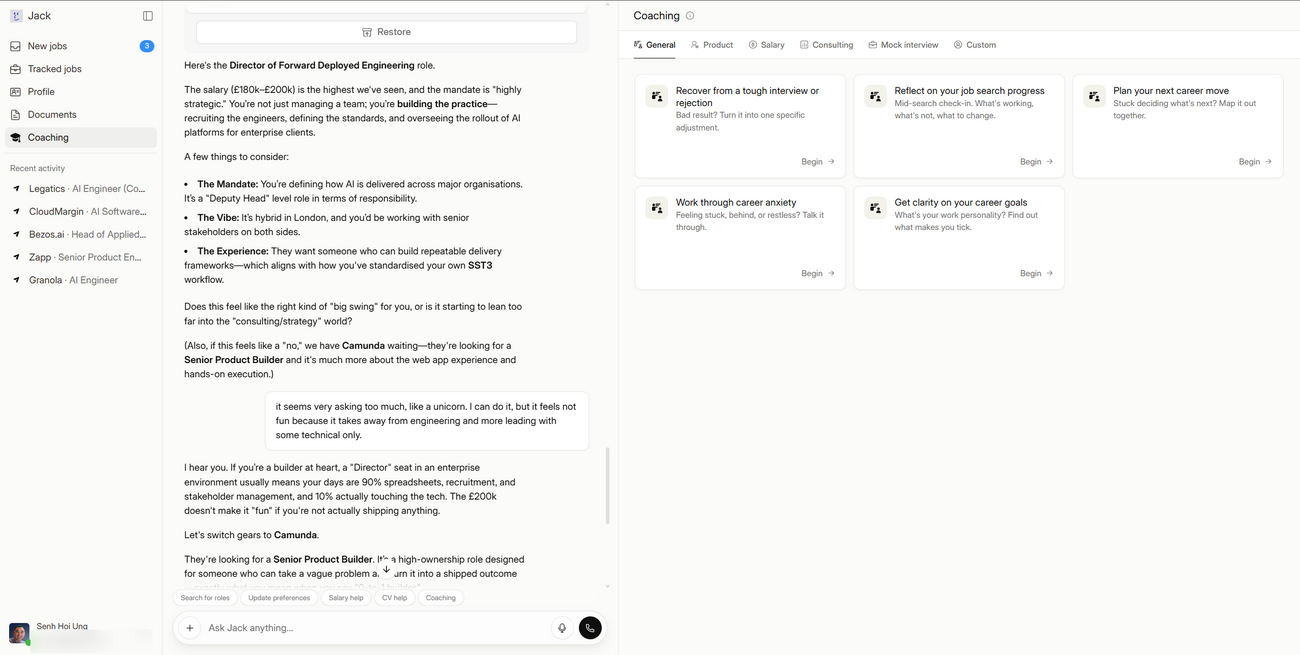
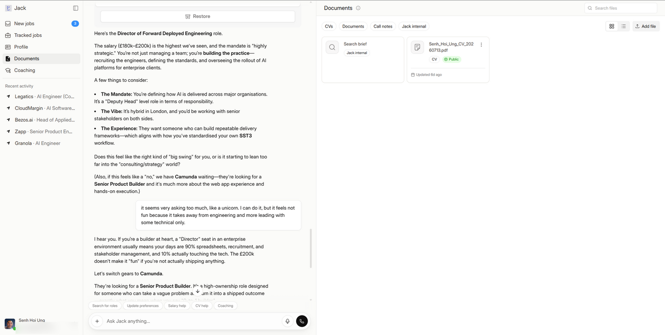
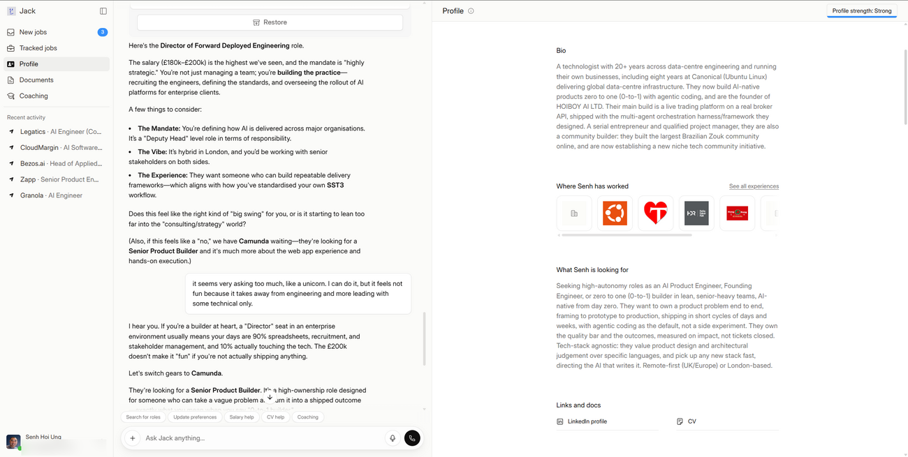
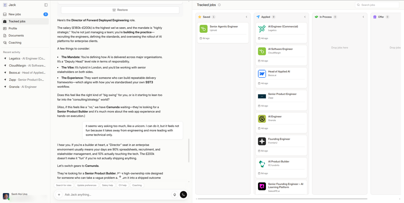
I really really appreciated that, because it’s clearly a choice. Someone sat down and decided NOT to cram everything in.
I mostly live in Claude Code, the command-line version, and honestly that’s part of why the simple thing stood out to me. It barely changes week to week, because it’s a CLI (you just type at it, there’s nothing to bolt extra buttons onto). But when I do open Claude on the web or the desktop app lately, it’s starting to feel like way too much. Too many menu items, too many things bolted on, all packaged into one product until you’re not quite sure where anything lives anymore. (I say this as someone who loves Claude and uses it every single day, so this is coming from love, not a dig.) It’s the classic trap. A product does one thing beautifully, then slowly tries to do everything, and the simplicity quietly dies.
Jack & Jill hasn’t fallen into that yet. Keep the front simple. Put all the cleverness in the backend, where it belongs, doing the hard graft of matching me to the right roles. That’s how I’d build it too. The person using it shouldn’t feel the machinery grinding away. They should just feel like it works.
So here’s my one hope for them, unglamorous as it sounds. Don’t add stuff for the sake of it. Resist it. Keep it this simple, and let the smarts live under the hood.
Not all roses (yet)
Now, don’t get me wrong, it’s not perfect.
Some roles I could apply to directly, right there, without ever leaving the site. Lovely. But others still bounced me out to a linked portal to finish the application the old-fashioned way. Which is fine, it’s just not the dream. The dream is one place, one flow, done.
I suspect that’s less about the tool and more about the relationships behind it. The more companies that sign up to post their jobs directly on the platform, the more of those applications can happen in the one place. So it’s a growing-pains thing, not a design flaw. As they build out those company relationships, I’d expect more and more of it to become apply-direct. Fingers crossed.
Worth a try
Would I recommend it? Yeah, genuinely. If you’re job hunting, or even just a bit curious about what’s out there without wanting to burn a whole weekend on it, give it a go. Chat to it, tell it what you hate, let it do the tedious bit.
Quick honesty note (because I’d want to know): the link below is my referral link. It only works one way, I get a small kickback if you actually land a job through it, which helps chip away at my ever-growing AI bills. No pressure either way, and the tool stands perfectly well on its own.
Job hunting will probably always be a bit of a pain. But this took a real chunk of that pain out, and it did it without making me learn yet another cluttered dashboard. I’ll take that.
Give Jack & Jill a go <-- Click here, good luck and happy job hunting!!!